Project Overview
The Product
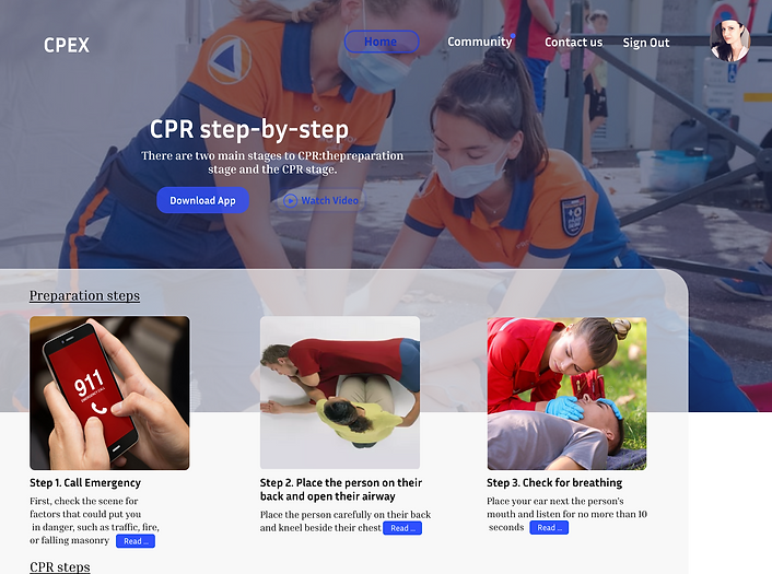
CPEX is an utility app specifically designed for mobile and smart watch users which guides people to give CPR in case of any emergency. It guides the users step by step by audio and images that what to do during the time and how to give CPR. The user also can read more about CPR from this app.
Project Duration
6 weeks(April 2021)
My Role & Responsibilities
UX Research, UX Design, UI Design

Project Vision
CPR is a life-saving first aid procedure. It can significantly improve someone’s changes of surviving if they suffer a heart attack or stop breathing following an accident or trauma. But most of the people are unaware that how to do the CPR in right manner. So our vision is to provide an app which can aware people about CPR and can also guide them that how to do the CPR in case of any emergency.
Key Challenges
-
Now most of the peoples are unaware about giving CPR and it can be a new thing for someone and that's why most of the people are afraid to give CPR.
-
The CPR procedure is different for an Adult and child or infant person. So it is difficult to give them properly.
-
Some people are got some trainings about CPR but during the emergency sometimes they may forget about all the procedures.
-
Sometimes people visits a remote locations or far away from any medical infrastructures so that time if a person needs CPR then it is very difficult to give CPR for a new person without any guidence.

Paper wireframe
In order to analyse and develop how a user would navigate the app, how s/he would achieve certain tasks, I sketched a few wireframes to understand each scenario a user could encounter with .I included a few examples of different screen sketches to better portray my train of thoughts and my methods of developing an idea for different platforms.
Meet the user
To help communicate information about users what I collected during research, I created persona. Tatiana is our fictional character which represents the group of people for which the app is design for. By creating the person I tried to create empathy with the end users and what needs and expectations are going to have the user from this design.


Affinity diagram
After conducting the user research, I collected all the data, I analysed it and synthesised it. I created an affinity map in order to organise better key findings which the users are facing during the usability test which leading them confusions and stopping them to completing some steps. With the help of this diagram we prioritise the issues as per their impacts and fixed them.
User research: pain points
By the various usability test we find out some of the major pain points which was misleading the users and causing the confusions and deadeneds.

Audio Guidance
During giving the CPR it was very unpleasant to look again and again to the phone screen to read about what to do plus it was giving a very poor user experience.
So we add the voice guidance which guides the people that what to do. And we are also planning to add the voice in different languages so that more people will understand and can use the app. This feature is only available in CPR steps.

Timer
Time is very important and precious when we are talking about health. In our previous designs some of the users were absolutely didn't know much about CPR and also they didn't know that how much time should they do each steps.
So to fix this we added a timer on the screen for each steps that how much time should they do it and also the pages changes automatically after some times. It also enhance the handsfree experience.

Dedicated Buttons
During the tests our users encountered with some pages which was leading to nowhere and some quick access buttons.
For this issues we added some buttons in different pages(e.g on page 6 REPEAT button to again go to the first page, A quick access button on home page for the CPR steps etc.
Mockups